

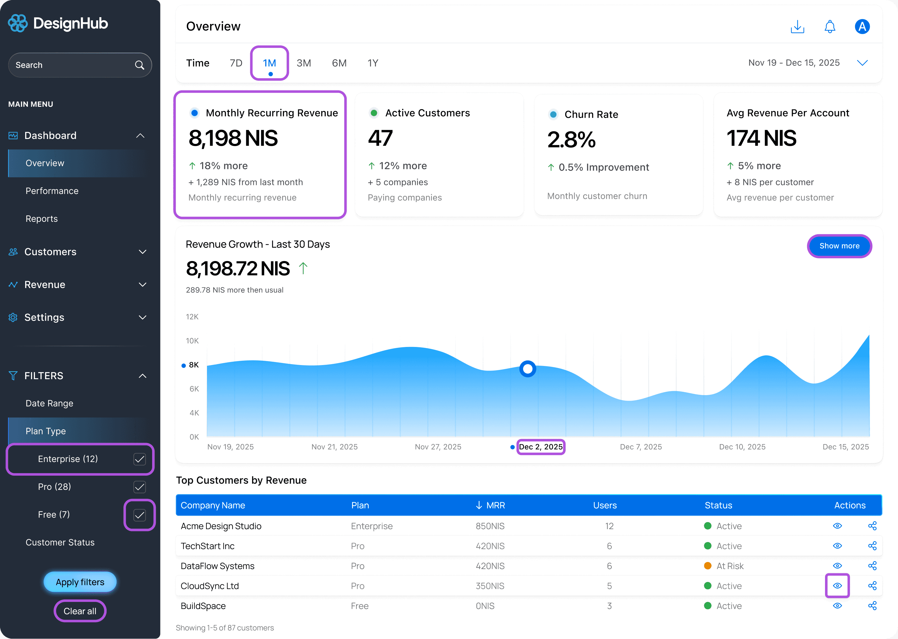
Revenue dashboard for SaaS founders tracking Monthly Recurring Revenue, customer growth, churn rates, and revenue per account.
Built accessibility into every decision from the start—keyboard navigation, NVDA support, WCAG AA compliance throughout.


✓ WCAG 2.1 AA compliant (14.08:1 contrast verified)
✓ Complete keyboard navigation with visible focus
✓ NVDA screen reader tested
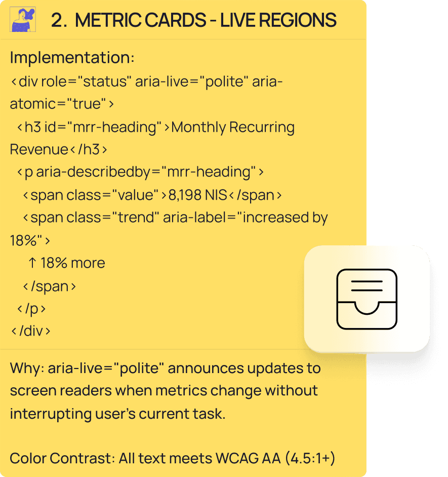
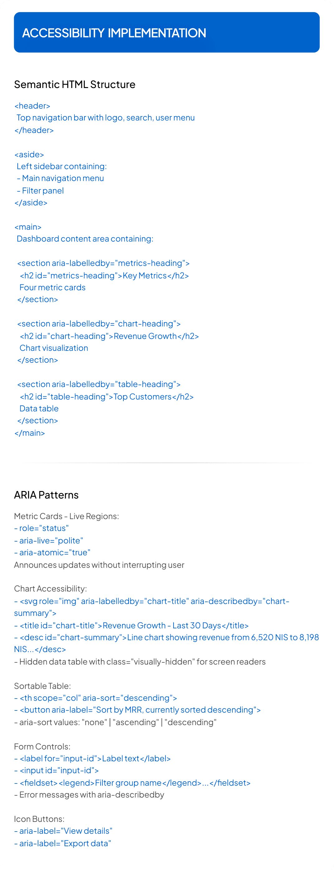
✓ ARIA live regions for metric updates
✓ Sortable tables with announcements
✓ Color + text status indicators
✓ 44px touch targets (32px dense tables)
✓ Semantic HTML structure

• Click or press Enter to sort columns.
• Status indicators: Green ● "Active", Yellow ● "At Risk", Red ● "Churned"—color plus text always.
• Sortable headers use <th scope="col" aria-sort="descending"> with buttons.
Screen readers announce: "MRR, sortable, currently highest to lowest. Press Enter to sort."
Status dots: <span aria-hidden="true"></span> <span>Active</span> hides decoration, keeps text.
Table rows 32px (acceptable for desktop density). Interactive elements 44px touch targets.


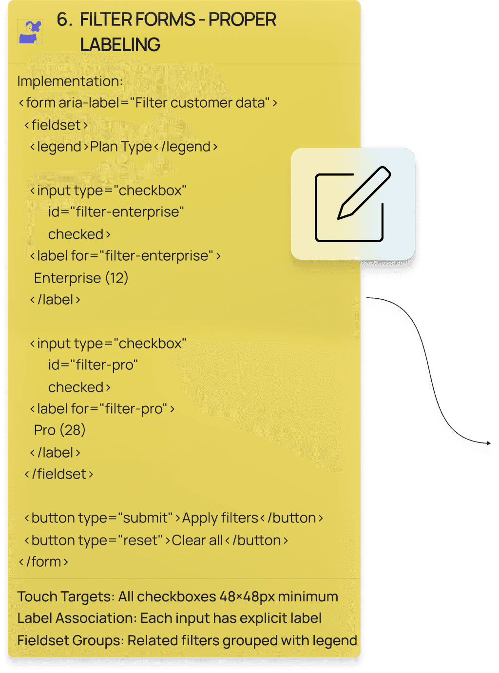
• Segment by plan type, status, or date range.
• Grouped filters with <fieldset><legend>Plan Type</legend> so screen readers announce context first.
• Every input has explicit label: <label for="filter-enterprise">Enterprise (12)</label>.
• Touch targets 44px.
• Tab through, Space toggles, 3px focus indicators with 2-4px offset.
• Screen readers: "Plan Type, group. Enterprise 12, checkbox, checked."
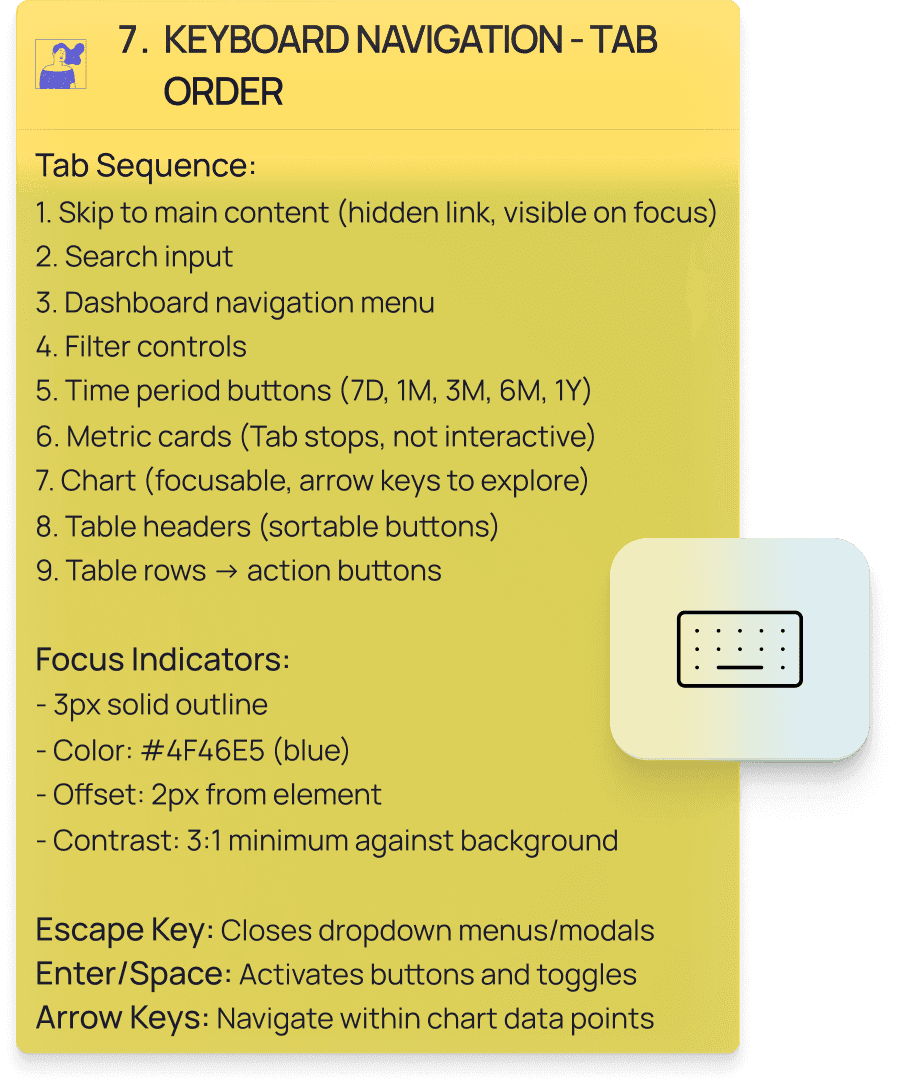
Complete keyboard control.
Skip to main content, then tab through navigation, filters, buttons, chart (arrow keys explore), sortable table headers, action buttons.
Tab order follows visual layout.
Enter/Space activates.
Arrow keys navigate.
Escape closes.
Focus indicators: 3px solid purple(#4F46E5), 2px offset, 3:1 contrast.
Tested complete flow with NVDA on Windows. Semantic HTML landmarks (header, aside, main, section) provide structure.
Table navigation: "MRR, column header button, sortable, currently sorted descending. 850 NIS. Acme Design Studio. Enterprise plan. 12 users. Active status."
Sort activation: "Sorted by MRR, currently highest to lowest. Press Enter to sort lowest to highest."
Chart description: "Revenue Growth - Last 30 Days. Image. Line chart showing revenue increasing from 6,520 NIS on November 19 to 8,198 NIS on December 15. Overall upward trend with 18 percent growth."
Metric updates: "Monthly Recurring Revenue. Status. 8,198 NIS. Increased by 18 percent."
Filter groups: "Plan Type, group. Enterprise 12, checkbox."
Chart includes hidden data table for complete dataset access.
Live regions announce updates politely.
Form labels associate correctly.
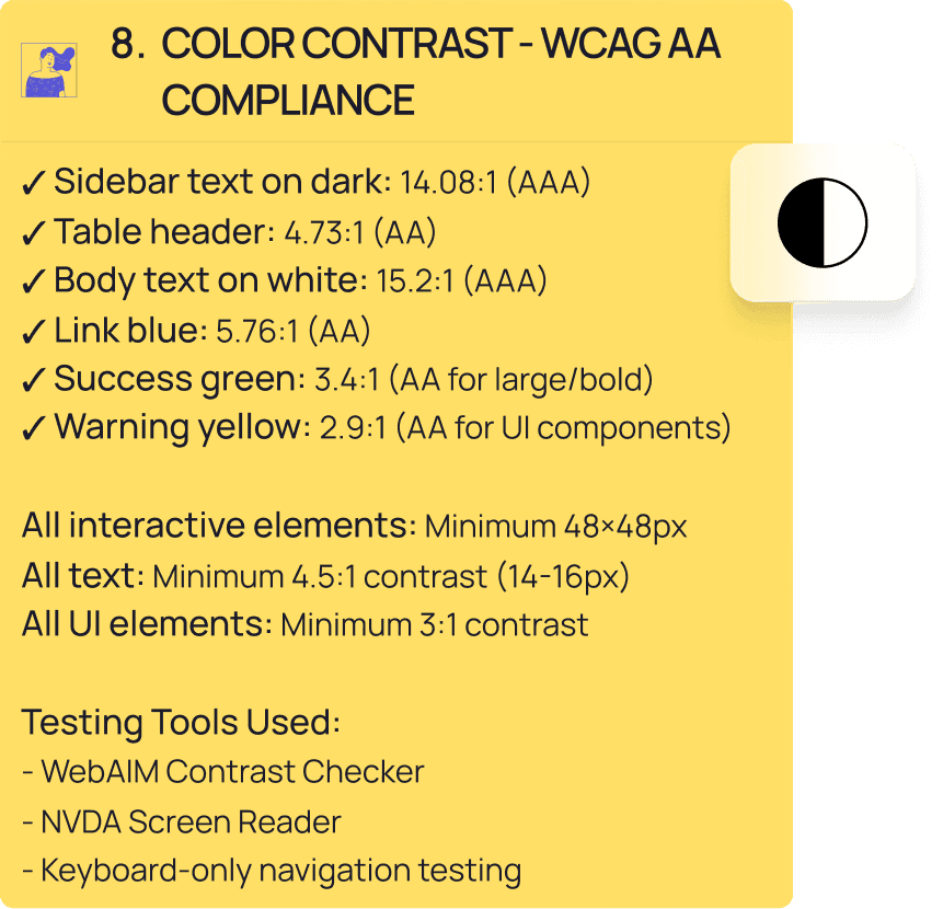


WebAIM Contrast Checker: All ratios meet WCAG AA (4.5:1 text, 3:1 UI)
Keyboard-only: Unplugged mouse. Every feature accessible via Tab, Enter, Space, Arrows, Escape.
Color blindness simulation: Information never color-dependent. Status indicators pair color with text.
Touch targets: 44px interactive elements, 32px dense table rows (desktop standard).
NVDA Screen Reader:
• Complete navigation tested.
• Table headers provide cell context.
• Sort states announce clearly.
• Chart has text description plus hidden data table.
• Live regions work without interruption.
• Filter groups announce context before options.
• WCAG 2.1 Level AA compliant.
• All text 4.5:1 minimum (most 7:1+).
• UI components 3:1 minimum.
• Complete keyboard functionality.
• Visible focus indicators 3:1 contrast.
• ARIA patterns: Live regions for updates, sortable tables with state management, explicit form labeling, hidden screen reader content, semantic landmarks, icon button labels.
• Keyboard navigation: Logical tab order, skip link, arrow key chart exploration, Enter/Space activation, Escape closes dropdowns.
• Color never conveys information alone.
• Status indicators combine color with text. Verified with WebAIM.
• Created developer documentation: color system, typography, spacing, component specs, ARIA patterns, keyboard requirements, testing checklist.
• Working prototype developed with AI assistance from comprehensive accessibility specifications, validated through NVDA testing and keyboard-only navigation.

Accessibility: WCAG 2.1 Level AA
ARIA: Live regions, sortable tables, form controls, landmarks, semantic structure
Testing: NVDA, WebAIM, keyboard-only, color blindness simulation
Contrast: 4.5:1 text minimum (most 7:1+), 3:1 UI minimum
Touch Targets: 44px standard, 32px dense tables
Keyboard: Complete control, visible focus indicators
Documentation: Developer handoff specs
*Portfolio project demonstrating accessibility implementation for B2B SaaS analytics. December 2025. No real users or business metrics.*

